| Latest | Greatest | Lobby | Journals | Search | Options | Help | Login |
|
|
|
This topic is archived. |
| Home » Discuss » Archives » General Discussion (1/22-2007 thru 12/14/2010) |
|
| krispos42
|
Thu Jun-07-07 04:28 AM Original message |
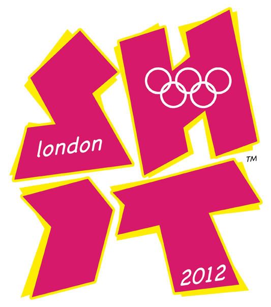
| Dear God, the London 2012 logo is bad |
| Printer Friendly | Permalink | | Top |
| etherealtruth
|
Thu Jun-07-07 04:31 AM Response to Original message |
| 1. Well it appears as if the peoplee in the UK agree |
| Printer Friendly | Permalink | | Top |
| krispos42
|
Thu Jun-07-07 04:42 AM Response to Reply #1 |
| 5. Rachel Maddow mentioned it on her show... |
| Printer Friendly | Permalink | | Top |
| Cessna Invesco Palin
|
Thu Jun-07-07 04:54 AM Response to Reply #1 |
| 10. There's an animated version as well. |
| Printer Friendly | Permalink | | Top |
| krispos42
|
Thu Jun-07-07 04:57 AM Response to Reply #10 |
| 11. Yay! Just like Pokemon! |
| Printer Friendly | Permalink | | Top |
| Occulus
|
Thu Jun-07-07 09:39 AM Response to Reply #11 |
| 44. It was pretty much all of it, as I recall |
| Printer Friendly | Permalink | | Top |
| youthere
|
Thu Jun-07-07 09:23 AM Response to Reply #10 |
| 35. It's pretty vomit inducing just sitting there. |
| Printer Friendly | Permalink | | Top |
| POAS
|
Thu Jun-07-07 04:36 AM Response to Original message |
| 2. $800,000 worth of ugly! |
| Printer Friendly | Permalink | | Top |
| The Straight Story
|
Thu Jun-07-07 04:36 AM Response to Original message |
| 3. And I think they paid 400,000 pounds for it too |
| Printer Friendly | Permalink | | Top |
| Omphaloskepsis
|
Thu Jun-07-07 04:40 AM Response to Original message |
| 4. It makes me think of the ZOOM logo... |
| Printer Friendly | Permalink | | Top |
| cassiepriam
|
Thu Jun-07-07 04:44 AM Response to Original message |
| 6. I am the only one on the planet who doesn't think it is so bad. |
| Printer Friendly | Permalink | | Top |
| dysfunctional press
|
Thu Jun-07-07 08:25 AM Response to Reply #6 |
| 27. so- how do you plan on spending the 400,000 pounds...? |
| Printer Friendly | Permalink | | Top |
| cassiepriam
|
Thu Jun-07-07 09:26 PM Response to Reply #27 |
| 70. LOL I wish :) |
| Printer Friendly | Permalink | | Top |
| Mike Daniels
|
Thu Jun-07-07 09:28 AM Response to Reply #6 |
| 40. It's grown on me the more I've looked at it |
| Printer Friendly | Permalink | | Top |
| Posteritatis
|
Thu Jun-07-07 11:35 AM Response to Reply #6 |
| 64. I like it, myself |
| Printer Friendly | Permalink | | Top |
| theHandpuppet
|
Fri Jun-08-07 09:10 AM Response to Reply #6 |
| 81. No, that really doesn't surprise me |
| Printer Friendly | Permalink | | Top |
| cassiepriam
|
Fri Jun-08-07 12:17 PM Response to Reply #81 |
| 86. ROTFLMAO............ That is good, you got me! And my heart thingy is worse than you can imagine |
| Printer Friendly | Permalink | | Top |
| T_i_B
|
Thu Jun-07-07 04:45 AM Response to Original message |
| 7. Reaction in the UK blogosphere has been overwhelmingly negative |
| Printer Friendly | Permalink | | Top |
| muriel_volestrangler
|
Thu Jun-07-07 05:06 AM Response to Reply #7 |
| 13. Will you mention 'Lisa', or shall I? |
| Printer Friendly | Permalink | | Top |
| Bluebear
|
Thu Jun-07-07 05:14 AM Response to Reply #13 |
| 16. Or what Lisa is doing? |
| Printer Friendly | Permalink | | Top |
| Tesha
|
Thu Jun-07-07 07:10 AM Response to Reply #16 |
| 19. Hint: When Monica did it, people shouted "Off with his head!" (NT) |
| Printer Friendly | Permalink | | Top |
| Cessna Invesco Palin
|
Thu Jun-07-07 06:32 AM Response to Reply #13 |
| 18. I saw that post in the other thread. |
| Printer Friendly | Permalink | | Top |
| bunkerbuster1
|
Thu Jun-07-07 09:24 AM Response to Reply #18 |
| 38. Had I not heard this before seeing the logo... |
| Printer Friendly | Permalink | | Top |
| Spinzonner
|
Thu Jun-07-07 04:49 AM Response to Original message |
| 8. I find it suggestive of a swastika |
| Printer Friendly | Permalink | | Top |
| Nikki Stone1
|
Thu Jun-07-07 07:37 AM Response to Reply #8 |
| 20. So do I. I wonder what the symbolism is behind the graphic. |
| Printer Friendly | Permalink | | Top |
| dysfunctional press
|
Thu Jun-07-07 08:32 AM Response to Reply #20 |
| 28. i'm wondering if it's meant to represent the nations of the u.k.? |
| Printer Friendly | Permalink | | Top |
| malaise
|
Thu Jun-07-07 10:34 AM Response to Reply #20 |
| 59. A punked up version of |
| Printer Friendly | Permalink | | Top |
| Bluebear
|
Thu Jun-07-07 04:54 AM Response to Original message |
| 9. Awful. And the animated version is causing seizures. |
| Printer Friendly | Permalink | | Top |
| moggie
|
Thu Jun-07-07 04:59 AM Response to Original message |
| 12. Worst game of Tetris ever n/t |
| Printer Friendly | Permalink | | Top |
| TZ
|
Thu Jun-07-07 05:13 AM Response to Reply #12 |
| 15. That was my thought as well.... |
| Printer Friendly | Permalink | | Top |
| Bluebear
|
Thu Jun-07-07 05:08 AM Response to Original message |
| 14. I love The Tube version that somebody proposed: |
| Printer Friendly | Permalink | | Top |
| SoCalDem
|
Thu Jun-07-07 07:58 AM Response to Reply #14 |
| 24. The sillies at b3ta were on this when London was chosen |
| Printer Friendly | Permalink | | Top |
| bunkerbuster1
|
Thu Jun-07-07 09:26 AM Response to Reply #14 |
| 39. Wow. Brilliant. |
| Printer Friendly | Permalink | | Top |
| dipsydoodle
|
Thu Jun-07-07 05:33 AM Response to Original message |
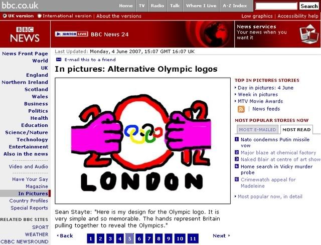
| 17. Here's a better one |
| Printer Friendly | Permalink | | Top |
| Minimus
|
Thu Jun-07-07 10:18 AM Response to Reply #17 |
| 52. I see: S H I T - is this a spoof? |
| Printer Friendly | Permalink | | Top |
| dipsydoodle
|
Thu Jun-07-07 11:07 AM Response to Reply #52 |
| 60. Something like that ! |
| Printer Friendly | Permalink | | Top |
| RL3AO
|
Fri Jun-08-07 12:53 PM Response to Reply #17 |
| 87. BWHAHAHA! |
| Printer Friendly | Permalink | | Top |
| ReverendDeuce
|
Thu Jun-07-07 07:40 AM Response to Original message |
| 21. I actually like it... and the animated version. |
| Printer Friendly | Permalink | | Top |
| NewJeffCT
|
Thu Jun-07-07 07:48 AM Response to Original message |
| 22. Supposedly the animated version induced epileptic seizures, too |
| Printer Friendly | Permalink | | Top |
| Occulus
|
Thu Jun-07-07 09:50 AM Response to Reply #22 |
| 47. Go to the UK forum link upthread |
| Printer Friendly | Permalink | | Top |
| La Lioness Priyanka
|
Thu Jun-07-07 07:48 AM Response to Original message |
| 23. i like it. very modert arti-ish. and equally pretensious. |
| Printer Friendly | Permalink | | Top |
| AllegroRondo
|
Thu Jun-07-07 08:15 AM Response to Original message |
| 25. What did the losing logos look like? |
| Printer Friendly | Permalink | | Top |
| dysfunctional press
|
Thu Jun-07-07 08:24 AM Response to Original message |
| 26. that is tooooo fucking funny... |
| Printer Friendly | Permalink | | Top |
| WiseButAngrySara
|
Thu Jun-07-07 08:39 AM Response to Original message |
| 29. Ghastly colors! ....n/t |
| Printer Friendly | Permalink | | Top |
| Auggie
|
Thu Jun-07-07 08:42 AM Response to Original message |
| 30. Brand consultant Wolff Olins created it. Bad, bad, bad! |
| Printer Friendly | Permalink | | Top |
| Auggie
|
Thu Jun-07-07 08:50 AM Response to Reply #30 |
| 32. And what's even worse is that a committee of people likely approved it. |
| Printer Friendly | Permalink | | Top |
| OnyxCollie
|
Thu Jun-07-07 08:49 AM Response to Original message |
| 31. It's nothing but a tangram. |
| Printer Friendly | Permalink | | Top |
| paparush
|
Thu Jun-07-07 10:31 AM Response to Reply #31 |
| 57. Or maybe a large, wooden, Badger.. |
| Printer Friendly | Permalink | | Top |
| tjwash
|
Thu Jun-07-07 09:21 AM Response to Original message |
| 33. Why does it look like a chalk outline at a crime scene? |
| Printer Friendly | Permalink | | Top |
| npincus
|
Thu Jun-07-07 09:22 AM Response to Original message |
| 34. it looks like stylized kanji... |
| Printer Friendly | Permalink | | Top |
| WinkyDink
|
Thu Jun-07-07 09:24 AM Response to Original message |
| 36. I kinda like their crop circles, myself! |
| Printer Friendly | Permalink | | Top |
| youthere
|
Thu Jun-07-07 09:24 AM Response to Original message |
| 37. Apparently the person who designed this was absent the day they taught art at art school. |
| Printer Friendly | Permalink | | Top |
| Fleshdancer
|
Thu Jun-07-07 09:36 AM Response to Original message |
| 41. Does that say 2012? |
| Printer Friendly | Permalink | | Top |
| WinkyDink
|
Thu Jun-07-07 09:49 AM Response to Reply #41 |
| 46. Thank you! I was wondering WTH it was supposed to be! |
| Printer Friendly | Permalink | | Top |
| Javaman
|
Thu Jun-07-07 09:37 AM Response to Original message |
| 42. Personally, I think it looks like someone dropped a swastika on the floor. nt |
| Printer Friendly | Permalink | | Top |
| WinkyDink
|
Thu Jun-07-07 11:18 AM Response to Reply #42 |
| 62. It DOES look like a swastika! |
| Printer Friendly | Permalink | | Top |
| porphyrian
|
Thu Jun-07-07 09:38 AM Response to Original message |
| 43. I get it, I just think it's ugly. |
| Printer Friendly | Permalink | | Top |
| muriel_volestrangler
|
Thu Jun-07-07 09:54 AM Response to Reply #43 |
| 49. I think that's the first time I've seen the suggestion it's also meant to be an athlete |
| Printer Friendly | Permalink | | Top |
| porphyrian
|
Thu Jun-07-07 09:57 AM Response to Reply #49 |
| 50. I'm a little crazy, so I see things like that, intended or not. |
| Printer Friendly | Permalink | | Top |
| muriel_volestrangler
|
Thu Jun-07-07 10:27 AM Response to Reply #50 |
| 55. You could be right |
| Printer Friendly | Permalink | | Top |
| porphyrian
|
Thu Jun-07-07 10:32 AM Response to Reply #55 |
| 58. Cool! I win! It's still ugly, though. - n/t |
| Printer Friendly | Permalink | | Top |
| Norrin Radd
|
Thu Jun-07-07 09:49 AM Response to Original message |
| 45. It looks like The Human Torch (60's Kirby version) took a crap. |
| Printer Friendly | Permalink | | Top |
| derby378
|
Thu Jun-07-07 09:52 AM Response to Original message |
| 48. Isn't that a drawing by Marilyn Manson when he was a baby? |
| Printer Friendly | Permalink | | Top |
| paparush
|
Thu Jun-07-07 10:10 AM Response to Original message |
| 51. Thoughts |
| Printer Friendly | Permalink | | Top |
| Dorian Gray
|
Thu Jun-07-07 10:21 AM Response to Original message |
| 53. When I saw it on the news |
| Printer Friendly | Permalink | | Top |
| muriel_volestrangler
|
Thu Jun-07-07 10:30 AM Response to Reply #53 |
| 56. They have done in 4 colours |
| Printer Friendly | Permalink | | Top |
| napi21
|
Thu Jun-07-07 10:22 AM Response to Original message |
| 54. Yes it has got a case of the uglies! I'm quite surprised too. |
| Printer Friendly | Permalink | | Top |
| sakabatou
|
Thu Jun-07-07 11:13 AM Response to Original message |
| 61. My eyes! THEY BUR~N! |
| Printer Friendly | Permalink | | Top |
| Auggie
|
Thu Jun-07-07 11:34 AM Response to Original message |
| 63. Why the trademark? No one is going to steal it. |
| Printer Friendly | Permalink | | Top |
| mainegreen
|
Thu Jun-07-07 11:41 AM Response to Original message |
| 65. It looks like little flaming turds. n/t |
| Printer Friendly | Permalink | | Top |
| kittykitty
|
Thu Jun-07-07 12:00 PM Response to Original message |
| 66. Looks like a puzzle when put together forms a SWASTIKA. |
| Printer Friendly | Permalink | | Top |
| jollyreaper2112
|
Thu Jun-07-07 12:28 PM Response to Original message |
| 67. alternative suggestion |
| Printer Friendly | Permalink | | Top |
| Cessna Invesco Palin
|
Fri Jun-08-07 06:04 AM Response to Reply #67 |
| 74. Goatse 2012? |
| Printer Friendly | Permalink | | Top |
| jollyreaper2112
|
Fri Jun-08-07 09:05 AM Response to Reply #74 |
| 78. I wish I had the link |
| Printer Friendly | Permalink | | Top |
| moggie
|
Fri Jun-08-07 06:25 AM Response to Reply #67 |
| 76. Roffle! |
| Printer Friendly | Permalink | | Top |
| slj0101
|
Fri Jun-08-07 09:10 AM Response to Reply #67 |
| 82. Oh my god. |
| Printer Friendly | Permalink | | Top |
| mainegreen
|
Fri Jun-08-07 09:18 AM Response to Reply #67 |
| 83. Holy cow. |
| Printer Friendly | Permalink | | Top |
| dolo amber
|
Fri Jun-08-07 09:23 AM Response to Reply #67 |
| 85. Oh NO! |
| Printer Friendly | Permalink | | Top |
| MountainLaurel
|
Thu Jun-07-07 12:53 PM Response to Original message |
| 68. What one friend saw here |
| Printer Friendly | Permalink | | Top |
| krispos42
|
Thu Jun-07-07 01:22 PM Response to Reply #68 |
| 69. Now I can't stop seeing that! |
| Printer Friendly | Permalink | | Top |
| tjwash
|
Thu Jun-07-07 09:31 PM Response to Reply #68 |
| 72. Someone told me that it looked like someone with their head down spewing chunks. |
| Printer Friendly | Permalink | | Top |
| OPERATIONMINDCRIME
|
Thu Jun-07-07 09:30 PM Response to Original message |
| 71. Oh My God What The Heck Is That? |
| Printer Friendly | Permalink | | Top |
| rasputin1952
|
Thu Jun-07-07 09:36 PM Response to Original message |
| 73. What the hell is that?... |
| Printer Friendly | Permalink | | Top |
| JustABozoOnThisBus
|
Fri Jun-08-07 06:22 AM Response to Original message |
| 75. Someone wanted to be as artistic as Barcelona |
| Printer Friendly | Permalink | | Top |
| Jeroen
|
Fri Jun-08-07 06:29 AM Response to Original message |
| 77. 5 continents which also represent the date |
| Printer Friendly | Permalink | | Top |
| hatrack
|
Fri Jun-08-07 09:07 AM Response to Original message |
| 79. Looks like somebody dropped some Olympic-themed Fiestaware . . . |
| Printer Friendly | Permalink | | Top |
| theHandpuppet
|
Fri Jun-08-07 09:08 AM Response to Original message |
| 80. Good Lord that's HIDEOUS!!!!!! |
| Printer Friendly | Permalink | | Top |
| cboy4
|
Fri Jun-08-07 09:18 AM Response to Original message |
| 84. You know, orange may not be my first choice, but I actually |
| Printer Friendly | Permalink | | Top |
| DU
AdBot (1000+ posts) |
Sun May 05th 2024, 08:15 AM Response to Original message |
| Advertisements [?] |
| Top |
| Home » Discuss » Archives » General Discussion (1/22-2007 thru 12/14/2010) |
|
Powered by DCForum+ Version 1.1 Copyright 1997-2002 DCScripts.com
Software has been extensively modified by the DU administrators
Important Notices: By participating on this discussion board, visitors agree to abide by the rules outlined on our Rules page. Messages posted on the Democratic Underground Discussion Forums are the opinions of the individuals who post them, and do not necessarily represent the opinions of Democratic Underground, LLC.
Home | Discussion Forums | Journals | Store | Donate
About DU | Contact Us | Privacy Policy
Got a message for Democratic Underground? Click here to send us a message.
© 2001 - 2011 Democratic Underground, LLC