Democratic Underground Latest Greatest Lobby Journals Search Options Help Login
Google

When to use black and white?

Printer-friendly format Printer-friendly format
Printer-friendly format Email this thread to a friend
Printer-friendly format Bookmark this thread
This topic is archived.
Home » Discuss » DU Groups » Arts & Entertainment » Photography Group Donate to DU
 
Rocinante Donating Member (1000+ posts) Send PM | Profile | Ignore Mon Nov-29-04 12:52 AM
Original message
When to use black and white?
This photo seems a good choice for b&w to me.


I've always wondered about this one though-it seems to me like it might have been much better as a color photograph. Any thoughts?

Printer Friendly | Permalink |  | Top
Clark4Prez Donating Member (507 posts) Send PM | Profile | Ignore Mon Nov-29-04 06:21 AM
Response to Original message
1. They both work
I think they both "work" in a technical sense. Did you get the picture you were hoping to capture is a better question.

B & W works great for shots of people. Look at the work of Henri Cartier-Bresson, he shot only in B & W and never used a flash. He was one of the most respected photographers from the 30's until his passing this year. Since it's copyrighted works, I can't link his images, but check out http://www.henricartierbresson.org/hcb/home_en.htm or http://www.photology.com/bresson/

Here's my best impression of Cartier-Bresson:

Printer Friendly | Permalink |  | Top
 
Rocinante Donating Member (1000+ posts) Send PM | Profile | Ignore Mon Nov-29-04 01:17 PM
Response to Reply #1
5. Yeah
I think both of them work pretty well, actually I try to stay away from doing color as much as possible. Here's another one that could be either way I guess.

Printer Friendly | Permalink |  | Top
 
funky_bug Donating Member (1000+ posts) Send PM | Profile | Ignore Mon Nov-29-04 06:23 AM
Response to Original message
2. Since my first responses were "oh wow" I would say you made good choices
I actually prefer very grainy black and white film... Ilford 3200 is my personal favorite. I agree with your assessment of the first, and though I can see where you might be interested in seeing the second in color, I feel it might detract from the final product. Black and white forces us to notice the nuances in light and dark, and with your second photograph, highlights the cheering fans. Their sillouettes tell the story, and I think if you had caught it in color, the distractions might have taken away from the mood of the shot.
Printer Friendly | Permalink |  | Top
 
Rocinante Donating Member (1000+ posts) Send PM | Profile | Ignore Mon Nov-29-04 01:21 PM
Response to Reply #2
6. I like the grainy effect too
I usually just push Tri X to get it. Here's one I tried, but it needs to be lightened up a bit, maybe.

Printer Friendly | Permalink |  | Top
 
Philostopher Donating Member (1000+ posts) Send PM | Profile | Ignore Mon Nov-29-04 11:40 AM
Response to Original message
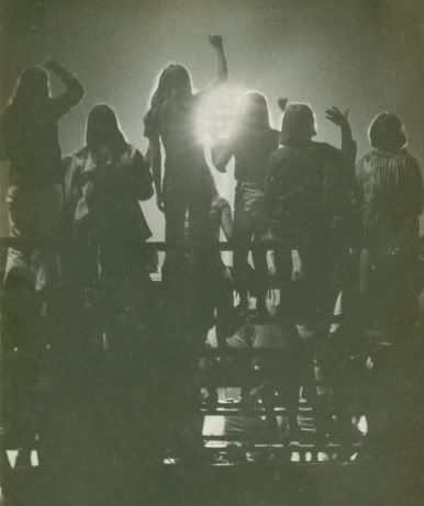
3. That's a tough call, on the second one.
Edited on Mon Nov-29-04 11:41 AM by Philostopher
I guess it would depend on whether color would have added anything to the shot. Likely not, actually, since you really took the picture for the contrast (I assume so, anyway).

I've got one here that probably would have been equally effective either way -- it just happened that I had black and white film in the camera, so that's what I got, but I think it probably would have been decent in color for different reasons (the red of the faded Coke sign might have made a neat effect), but I'm not sorry it ended up being B&W, either:


Edit -- I find that street scenes frequently are more effective in B&W, especially if the building or the architecture is the focus.
Printer Friendly | Permalink |  | Top
 
Rocinante Donating Member (1000+ posts) Send PM | Profile | Ignore Mon Nov-29-04 01:24 PM
Response to Reply #3
7. I like it
That turned out well. Here's one that I guess is better off being in color.

Printer Friendly | Permalink |  | Top
 
Philostopher Donating Member (1000+ posts) Send PM | Profile | Ignore Mon Nov-29-04 09:58 PM
Response to Reply #7
9. You're right about that one, I think.
The porch roof is a nice contrast with the grass.
Printer Friendly | Permalink |  | Top
 
NashVegas Donating Member (1000+ posts) Send PM | Profile | Ignore Mon Nov-29-04 01:02 PM
Response to Original message
4. When You Can
Get something more interesting in texture than color?

Circumstance doesn't always provide you with a harmonic color palette. And if you can't get one going yourself, B & W is great for those times; you can hang your photo on texture & geometry.

I agree, the lower photo might have done better as color. I would try Photoshoping it and playing with the contrast/bright levels.
Printer Friendly | Permalink |  | Top
 
Rocinante Donating Member (1000+ posts) Send PM | Profile | Ignore Mon Nov-29-04 01:25 PM
Response to Reply #4
8. I might try that
I have just a basic photoshop but that's a good idea.
Printer Friendly | Permalink |  | Top
 
alfredo Donating Member (1000+ posts) Send PM | Profile | Ignore Tue Dec-07-04 06:24 PM
Response to Original message
10. The second one is best black and white. Put it in Photoshop and play
with contrast and curves. You will be happy with what you can do with it. It is fine like it is, but it never hurts playing with it to see the possibilities.

There seems to be a spiritual feel about the picture.

The first one is a fine picture too. I wouldn't do a thing with it. It is perfect the way it is.


Printer Friendly | Permalink |  | Top
 
Touchdown Donating Member (1000+ posts) Send PM | Profile | Ignore Thu Dec-09-04 07:31 PM
Response to Original message
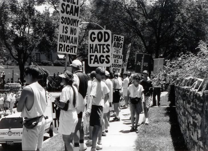
11. No other appropriate time than the Phelps Clan.
Printer Friendly | Permalink |  | Top
 
LeftPeopleFinishFirst Donating Member (1000+ posts) Send PM | Profile | Ignore Sat Dec-18-04 01:19 PM
Response to Original message
12. I use BW for everything
Especially architecture.
Printer Friendly | Permalink |  | Top
 
okasha Donating Member (1000+ posts) Send PM | Profile | Ignore Sun Dec-19-04 09:42 PM
Response to Original message
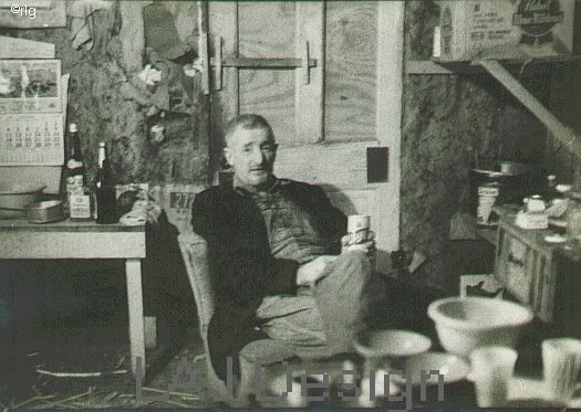
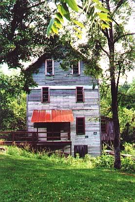
13. I have to put in my vote, too, that the first photo is perfect as is.
Color would ruin it. The only thing you might want to try with it is to sepia tone it, either in the darkroom--there are some good kits out now that won't overwhelm you with the rotten egg smell--or in Photoshop. Go to Hue/Saturation and set Hue at about 31-33. That might make an interesting alternative picture, not a replacement.

The only thing I never use black and white for is butterflies.

Okasha
Printer Friendly | Permalink |  | Top
 
DU AdBot (1000+ posts) Click to send private message to this author Click to view 
this author's profile Click to add 
this author to your buddy list Click to add 
this author to your Ignore list Tue Apr 30th 2024, 02:42 AM
Response to Original message
Advertisements [?]
 Top

Home » Discuss » DU Groups » Arts & Entertainment » Photography Group Donate to DU

Powered by DCForum+ Version 1.1 Copyright 1997-2002 DCScripts.com
Software has been extensively modified by the DU administrators


Important Notices: By participating on this discussion board, visitors agree to abide by the rules outlined on our Rules page. Messages posted on the Democratic Underground Discussion Forums are the opinions of the individuals who post them, and do not necessarily represent the opinions of Democratic Underground, LLC.

Home  |  Discussion Forums  |  Journals |  Store  |  Donate

About DU  |  Contact Us  |  Privacy Policy

Got a message for Democratic Underground? Click here to send us a message.

© 2001 - 2011 Democratic Underground, LLC