Interesting Electoral Map
Neil Freeman redrew the state borders to get a visual sense of what it would take for the electoral college votes to match the popular vote. That is to say, for each state to be weighted evenly.
"The largest state is 66 times as populous as the smallest," Freeman explains on his site, "and has 18 times as many electoral votes."
His map is based on 2010 Census data, which records a population of 308,745,538 for the United States. Divided up among 50 states, that's a population of a little over six million people per state. The names of new states are mostly taken from geographical features.
Before you freak out about the feasibility of such a plan or whether it's a real improvement on the electoral college, Freeman notes, "this is an art project, not a serious proposal. So take it easy with the emails about the sacred soil of Texas."
[URL= .html][IMG]
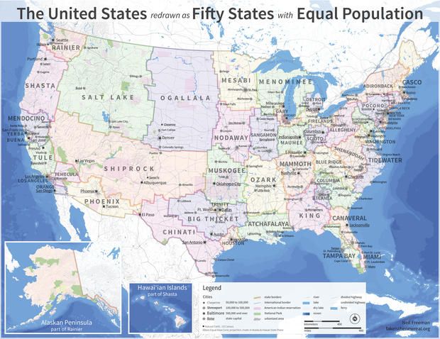 [/IMG][/URL]
http://mentalfloss.com/article/58809/us-map-redrawn-50-states-equal-population
 = new reply since forum marked as read