General Discussion
Related: Editorials & Other Articles, Issue Forums, Alliance Forums, Region ForumsWhat if the H logo were different colors?
I was just curious about how it would look with a different color scheme.
I think it does have a different impact. I don't think there is a political content in these, or there is only the ones we perceive.
[img] [/img]
[img] [/img]
[img] [/img]
[img] [/img]
[img] [/img]
[img] [/img]
 = new reply since forum marked as read
Highlight:
NoneDon't highlight anything
5 newestHighlight 5 most recent replies
= new reply since forum marked as read
Highlight:
NoneDon't highlight anything
5 newestHighlight 5 most recent replies

The Velveteen Ocelot
(115,836 posts)It's just not a very good design - it's blocky and graceless and looks like a street sign.
VScott
(774 posts)[img] [/img]
BlueJazz
(25,348 posts)

sammythecat
(3,568 posts)Now that you mentioned it though, yes!, that is exactly what it looks like. I'll never be able to think anything else when I see it.
They better be careful about posting that thing along any roadway. Not every emergency is taken to the hospital in an ambulance by a driver who knows the way. Beside the obvious tragedy of anyone's condition made worse or even dying because of delayed treatment, I can easily imagine lawsuits and huge embarrassment to her campaign if someone died because they took the wrong route to the hospital.

Auggie
(31,186 posts)To hell with the colors or direction. It needs fluidity.

tularetom
(23,664 posts)Its kind of dopey looking regardless of color.
dissentient
(861 posts)Using the blue color on the arrow part softens it somewhat, and is better than the red on blue color, but that doesn't address the core issue.
Takket
(21,625 posts)[link: |
|
I couldn't care less about the logo, but that will be the obvious parody t-shirt design.

SidDithers
(44,228 posts)Sid

freshwest
(53,661 posts)
If she ran on her last name instead of the first, with a C instead of an H, it could be more like Obama's.

betsuni
(25,610 posts)Help, once you start reading diabolical secret meanings into logos, you can't stop.
freshwest
(53,661 posts)Oh, they would definitely see the C as the Crescent. Just as they saw Egyptian symbolism with the O for Obama. So, BOO! On them!

ScreamingMeemie
(68,918 posts)The little tiny pics and avatars? Not a fan.

demmiblue
(36,885 posts)It seems to cut down on the harshness of all the angles.
This DUer did a nice representation:
http://www.democraticunderground.com/?com=view_post&forum=1002&pid=6496621
With that said, I think I am done thinking about the logo! 
edhopper
(33,615 posts)though I don't like the block H.
edhopper
(33,615 posts)the concept isn't bad, but the execution is.
dissentient
(861 posts)
daredtowork
(3,732 posts)It was a bit curvy, dynamic, pointed upward like a comet swash, and had a star in it. Made me wonder where that kind of creativity was during the design discussion.
Here's the pic by tomm2thumbs:
http://www.democraticunderground.com/10026496176#post88
dissentient
(861 posts)brush
(53,843 posts)once we start disecting this one, I see blue "twin towers" with a red swoosh.
IMO it doesn't pass the smell test either.
packman
(16,296 posts)I think someone should be fired for this - copyright infringement:
[URL= .html][IMG]
 [/IMG][/URL]
brush
(53,843 posts)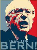
InAbLuEsTaTe
(24,122 posts)edhopper
(33,615 posts)seems to be unanimously negative.
You have to wonder who they tested it with and who said they liked it.
NuclearDem
(16,184 posts)edhopper
(33,615 posts)who likes it.
Though i haven't taken a poll.
But let's just say the reactions have been negative overall.
Have you seen a mostly positive response?
NuclearDem
(16,184 posts)it was hyperbole, you know exactly what i meant.
Your grammar correction is noted.


hobbit709
(41,694 posts)
FSogol
(45,525 posts)all is graphic design." Frank Conniff
for everyone harping about it.

Vinca
(50,303 posts)KittyWampus
(55,894 posts)it was 100% better.
I don't care for the icon but was amazed how much better the color switch made it.